Reimagining the Ride: A Modern Revival of Carpenter Body Works
Once a proud icon of American school transportation, Carpenter Body Works was a household name for generations of students and families across the country. Based in Mitchell, Indiana, the company’s legacy of craftsmanship and safety rode alongside millions of children through decades of dependable service.
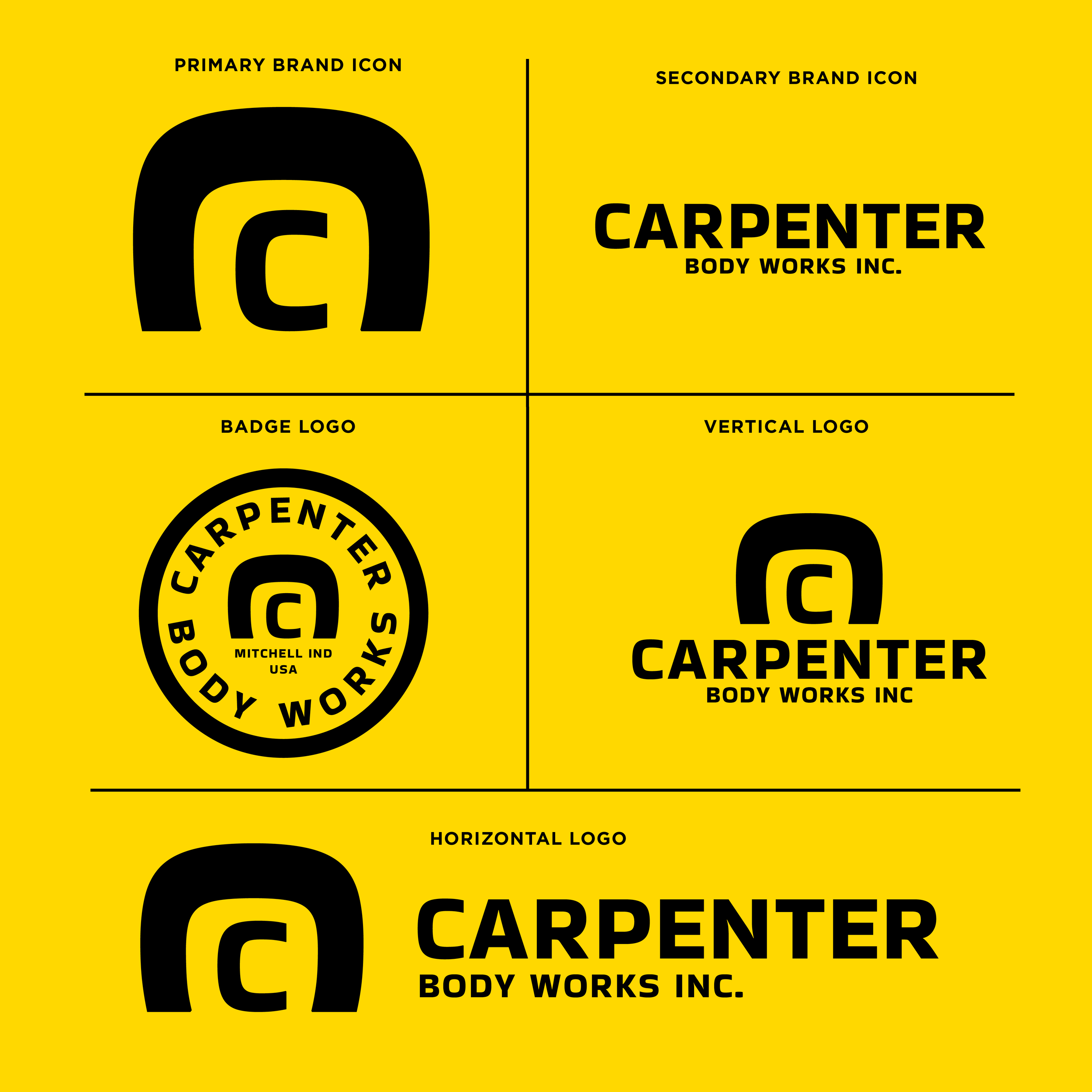
This logo redesign reintroduces Carpenter Body Works as if it were reborn today—modern, bold, and built to last.
The primary brand icon draws inspiration from the unmistakable curve of a school bus roofline—an abstract 'C' that mirrors the rear frame of Carpenter buses, balancing visual strength and rounded friendliness. It’s both a nod to the industrial design of mid-century American transit and a forward-looking emblem for a potential electric or next-gen bus manufacturer.
The typography is industrial and timeless, with clean, high-impact forms that echo the boldness of Carpenter’s original utility and American-made identity. The badge logo centers the brand in Mitchell, Indiana—rooting it in place, pride, and origin.
This flexible visual identity system includes horizontal and vertical lockups for practical use across print, digital, vehicle decals, and product labeling. It gives Carpenter Body Works the visual clarity and timeless grit it deserves—if it were building the future of student transport today.