Sharper Circuits, Sharper Identity: Redesigning NHanced Semiconductors
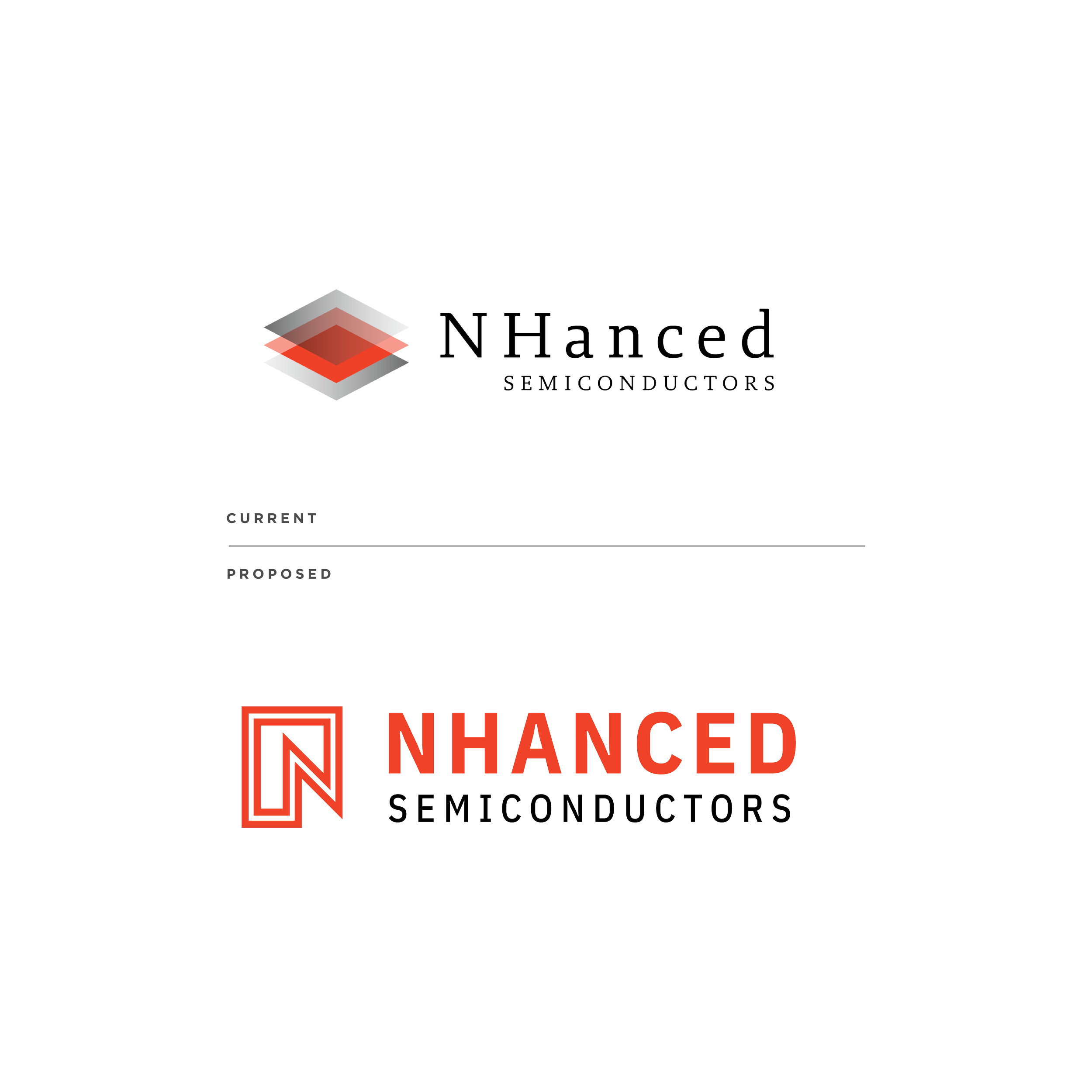
NHanced Semiconductors is a forward-leaning microelectronics company operating in one of the most precise, competitive, and innovation-driven industries. But their original logo—with serif typography and a layered 3D mark—no longer reflected the sharpness, clarity, and modernity demanded by today’s tech sector.
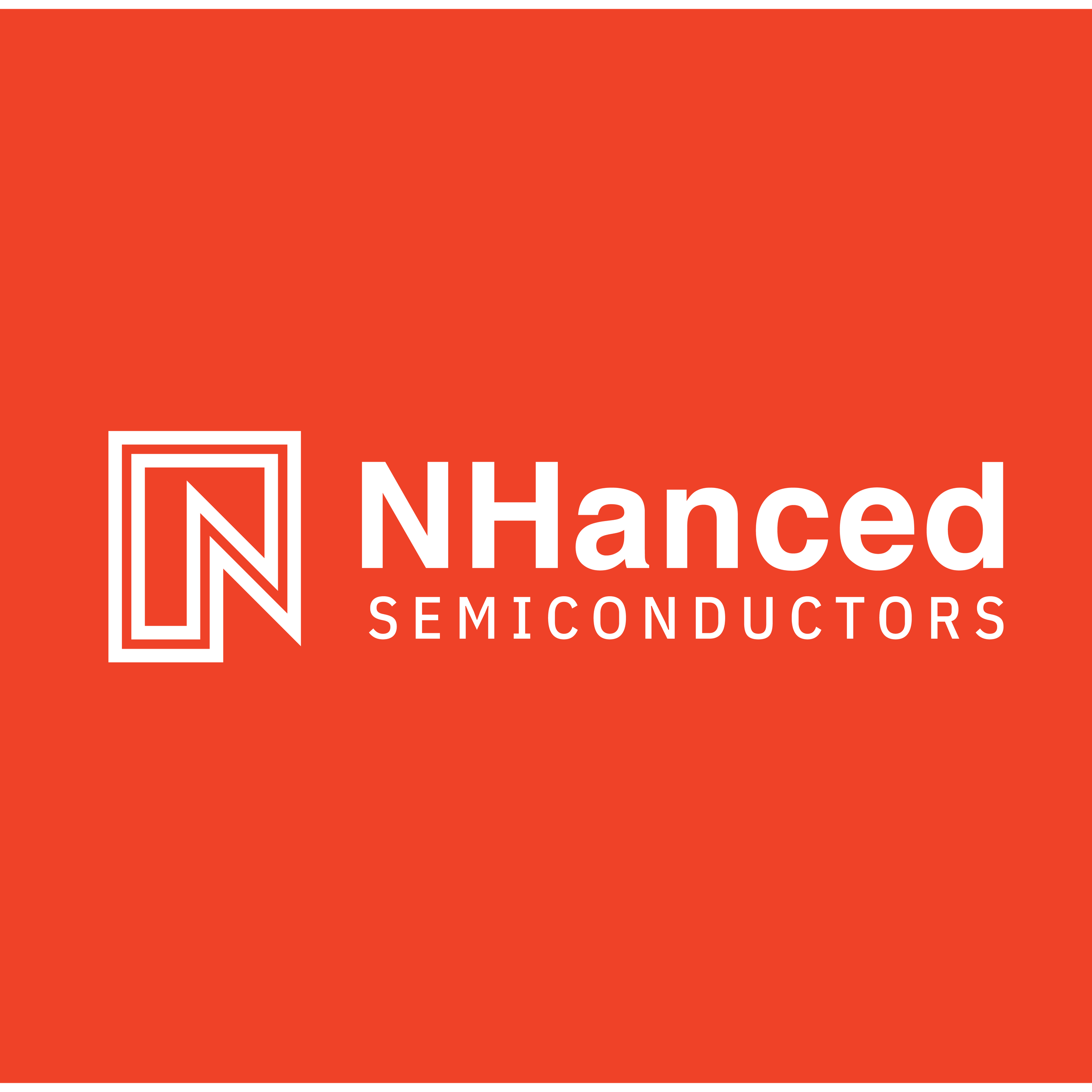
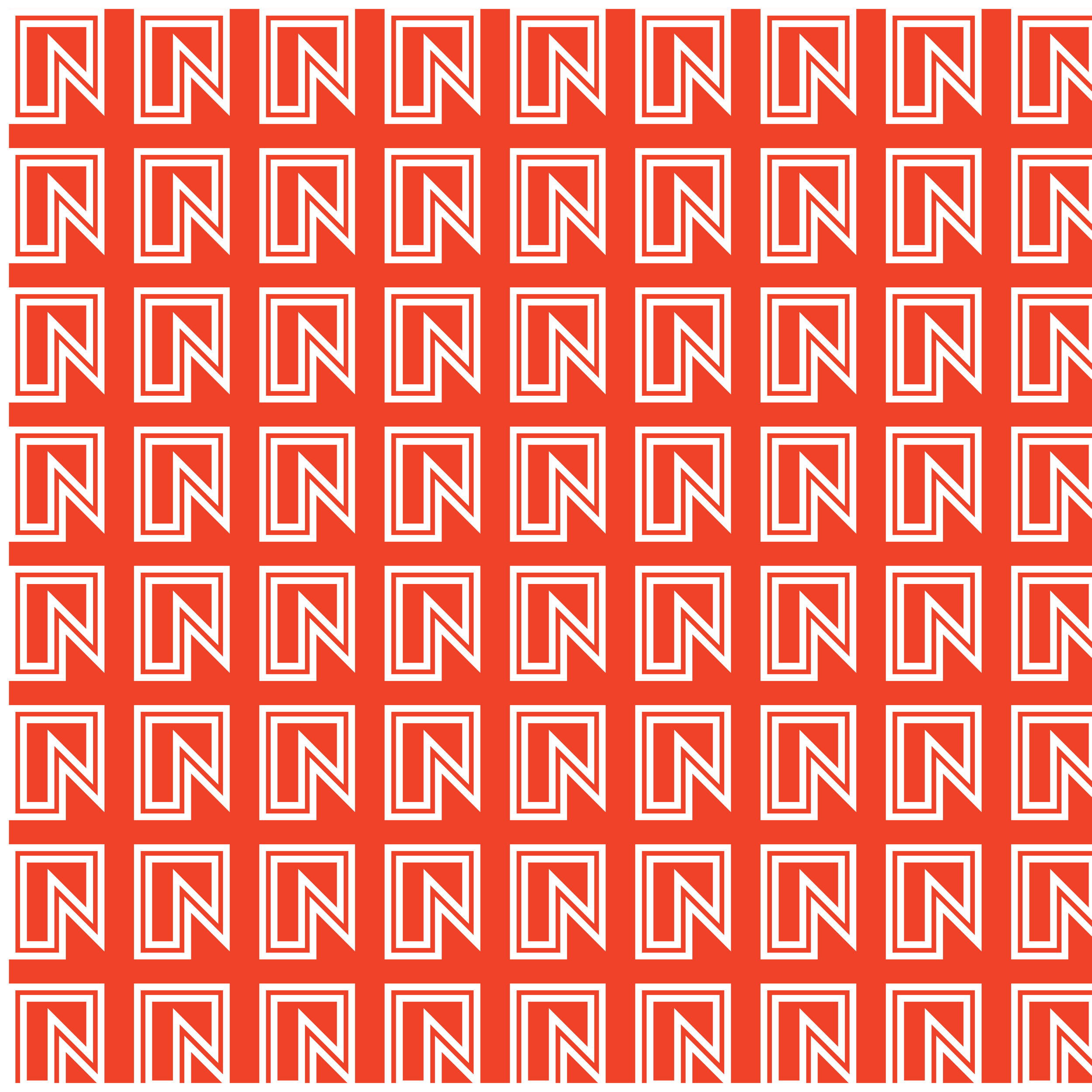
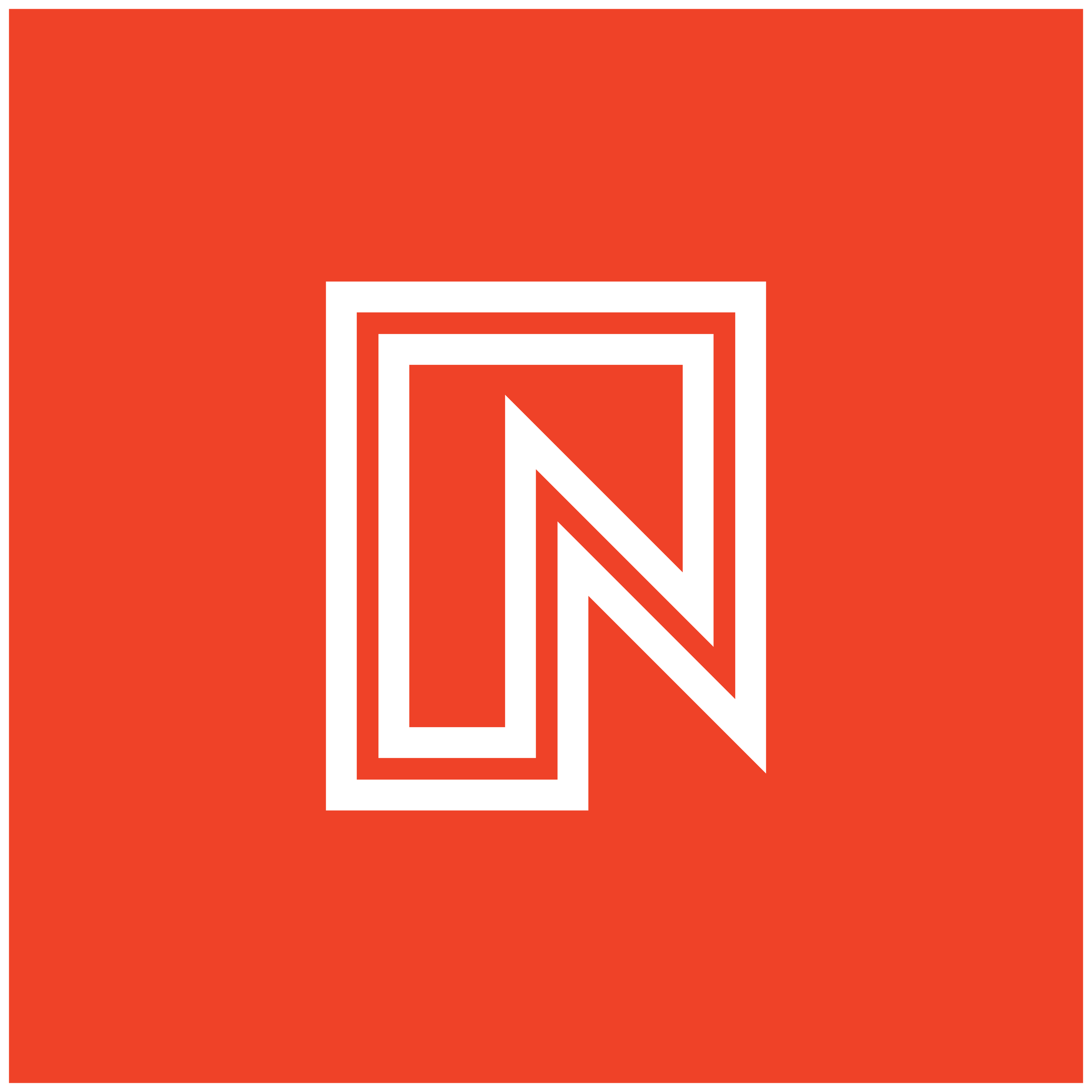
This redesign strips away legacy clutter in favor of bold geometry and direct communication. The new logo centers around a clean, interlocking “N” mark, built from nested lines that suggest circuit pathways, integration, and advancement. It also forms an angular corridor, alluding to forward motion, signal flow, and embedded systems architecture.
The wordmark shifts to a high-contrast sans-serif—NHanced set in bold, emphasizing the “NH” prefix while retaining technical readability across scales. The red-orange color palette evokes energy, heat, and innovation, while staying recognizable from the original brand.
The new identity works effortlessly across black, white, and color backgrounds, and scales from chip surface to tradeshow banner without loss of clarity.
This design gives NHanced Semiconductors the confident, contemporary face it needs—one that matches its technology, talent, and ambitions.