ManTech (Speculative Rebrand)
Client: Self-initiated concept under Hoosier Brand Studio
Sector: Defense Technology / National Security
Year: 2025
As part of Hoosier Brand Studio’s exploration into modern visual identities for the defense sector, I developed a speculative rebrand for ManTech—a leading defense contractor known for its work in cybersecurity, AI, and national security solutions. Although the company recently underwent a rebrand, this design serves as a creative case study to demonstrate how bold visual systems can express mission-critical values to stakeholders, warfighters, and strategic partners alike.
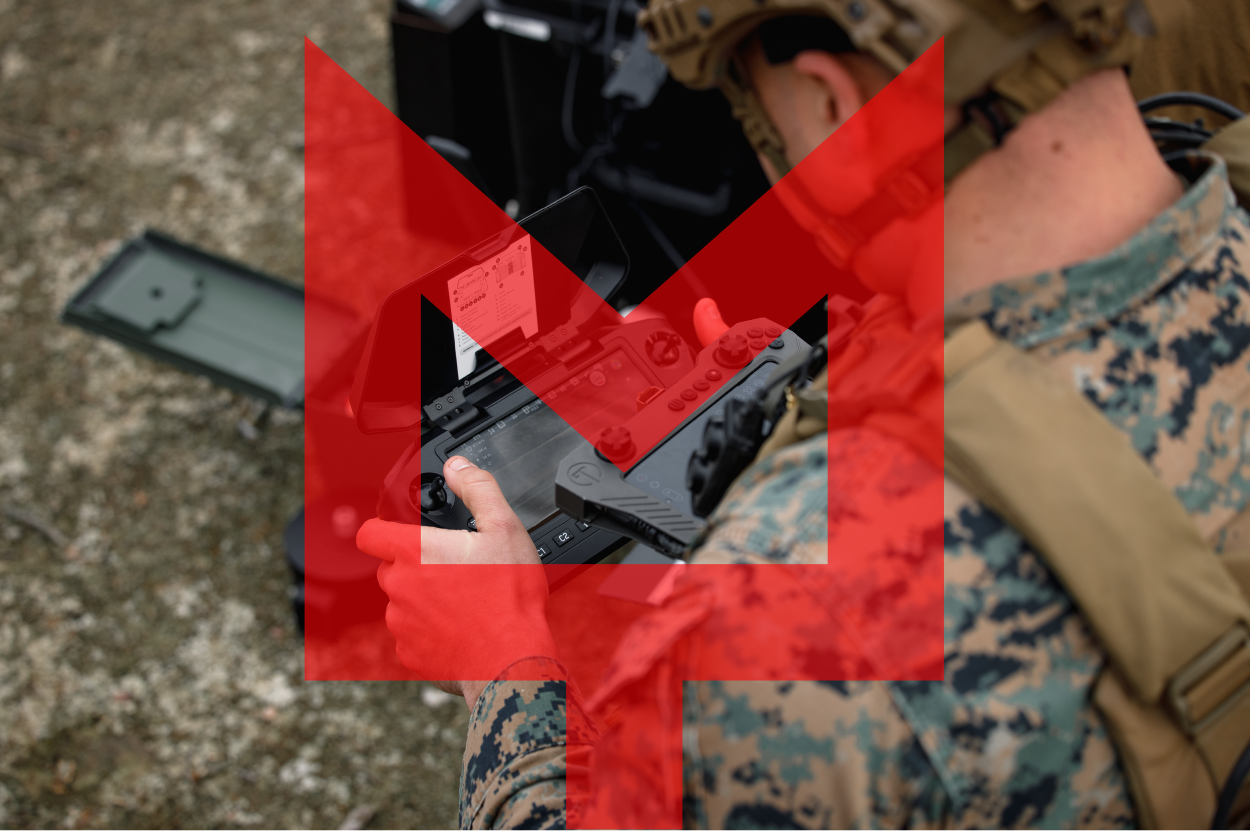
At the core of this identity is a symbol rooted in strength and precision. The custom “M” monogram is shaped with geometric clarity and a grounded stance—anchored to convey reliability, while upward angles suggest technological elevation and forward strategy. The sharp symmetry reflects the calculated nature of defense systems, while the symbol’s versatility allows it to adapt across platforms, including digital interfaces, uniforms, and field-ready applications.
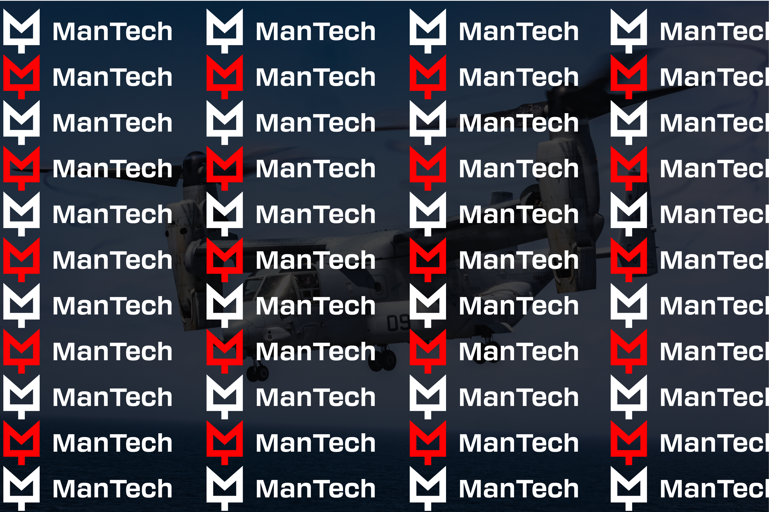
The branding package includes scalable iconography, camouflage-compatible variants, and pattern systems tailored for trade show displays, presentation decks, and operator equipment. Paired with a refined wordmark and bold red/white/black palette, the identity delivers cohesion across all touchpoints—from top brass briefings to boots-on-the-ground tech support.
This project highlights Hoosier Brand Studio’s focus on mission-driven visual communications—bringing clarity, confidence, and meaning to brands serving defense, industry, and innovation.


